The project logo and the “road signs” on the cycle track maps, feature a digitised all-capitals font based on the original that the Ministry of Transport used from 1933 through, with minor revisions, to 1958.
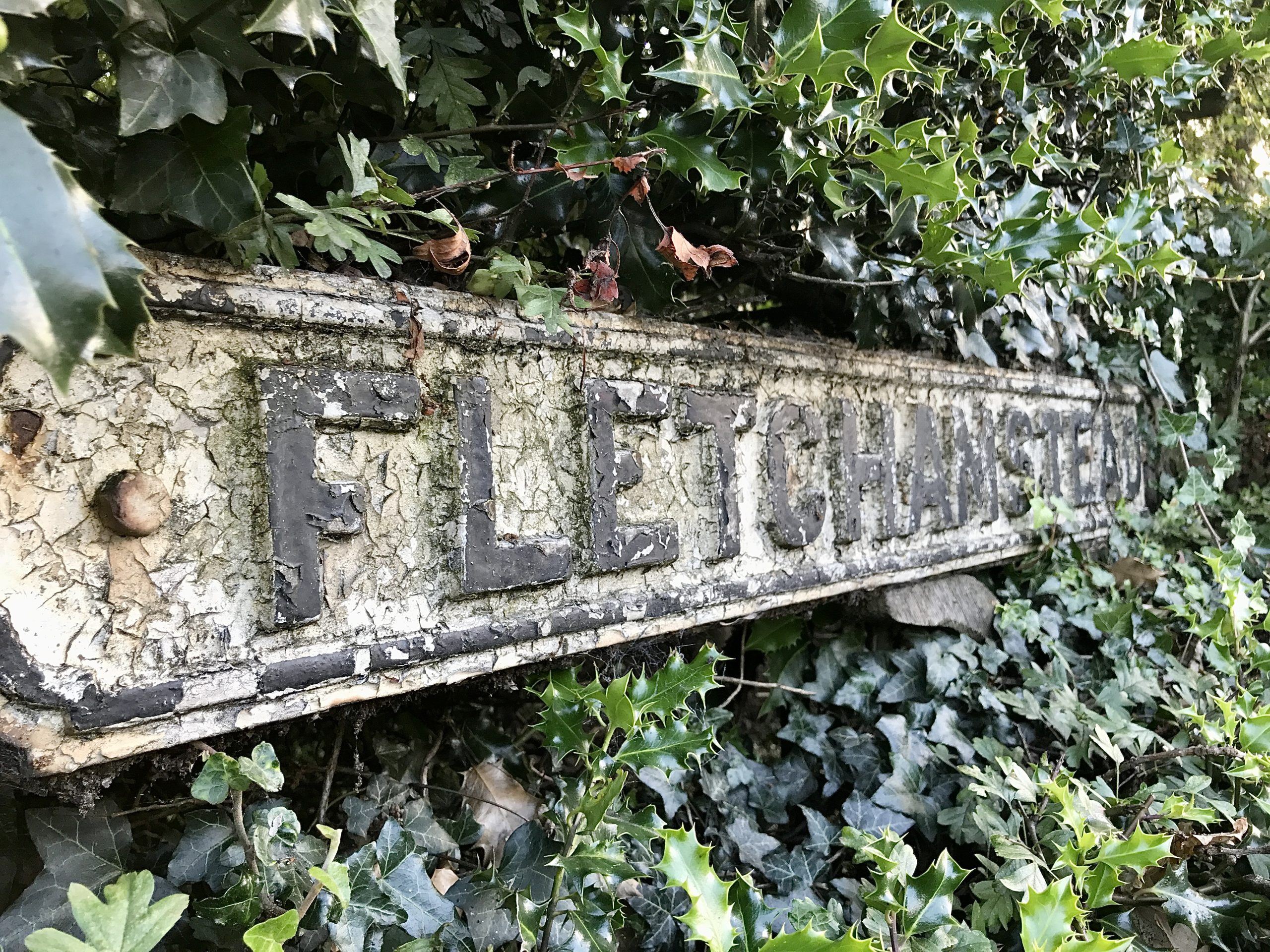
Probably originally designed by the civil servant Hubert Llewellyn-Smith, there is no period indication of the font’s name, but font libraries often label it as “Ministry.” The font is a revised version of an all-caps black alphabet on a white background first used in 1921 for fingerpost direction signs. In 1931, a committee chaired by Sir Henry Maybury was asked to recommend improvements to the signing then in use, and a revised font was introduced in 1933.
SIGN OF THE TIMES
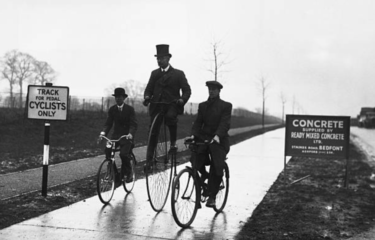
The MoT’s first cycle-track sign on the 1934 Ealing cycle track read “TRACK FOR PEDAL CYCLISTS ONLY” and did not feature a bicycle icon. Subsequent signs did.
Period photographs show that some of the cycle track entrances were marked with oblong signs stating the tracks were for “CYCLISTS ONLY.” Above this text was a fussy icon of a roadster bicycle complete with rod brakes and mudguards. It’s possible that all of the period cycle tracks, bar the Ealing one, featured such signage.

A writer in The Architectural Review from April 1937 took exception to the sign: “[The MoT’s] recently-issued sign for bicycle tracks appears to have lifted the picture from a catalogue and the word from a double-acrostic, so oddly spaced are the letters.”
“The absurdly realistic bicycle, fidgety in detail, could well be replaced by a more abstract symbol,” the writer argued.
Nevertheless, the Ministry of Transport stuck with the “realistic” bicycle until after the publication of Traffic Signs Regulations and General Directions of 1965. Known as TSRGD, this was informed by the Worboys report of 1963, which standardised Britain’s text-heavy road signs, partly by harmonising them with the more graphic-based road signs long common throughout the rest of Europe.
Some of the CYCLISTS ONLY signs were studded with small reflectors, as seen in an example currently displayed at the Beamish outdoor museum near Durham. A similar period example is in storage at the Coventry Transport Museum: it is cast iron and measures 60cm wide and 50cm deep. It was made by the Royal Label Factory of Stratford upon Avon, which is today trading as a subsidiary of Leander Architectural of Buxton.

NOTES
Known as TSRGD … In 1961 a committee appointed under Sir Walter Worboys reviewed traffic signs and font use. The result was the 1964 Traffic Signs Regulations, which specified a new standard national style based on a mixed case font.

